Brisk Tiger: Packaging Design

Project Overview
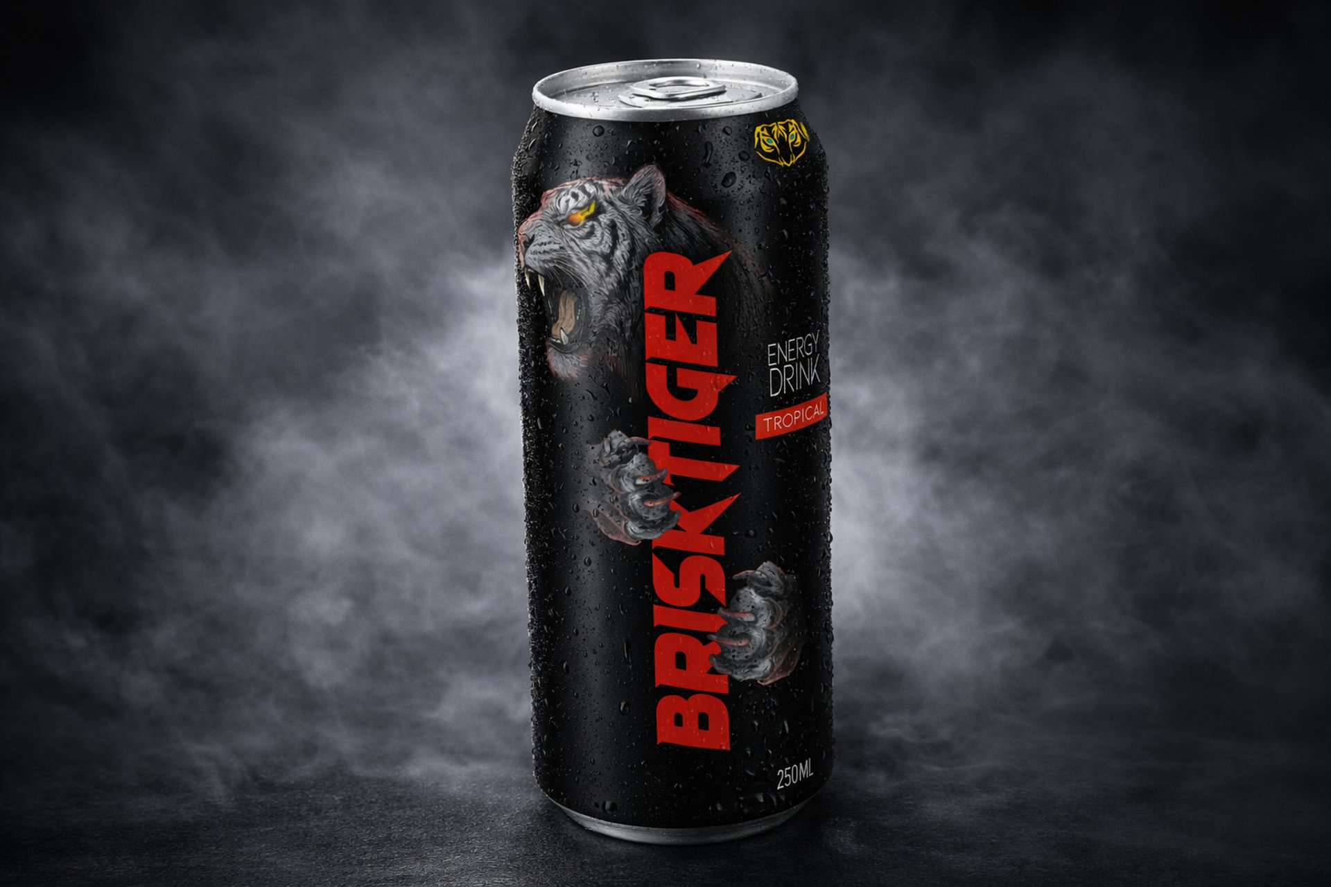
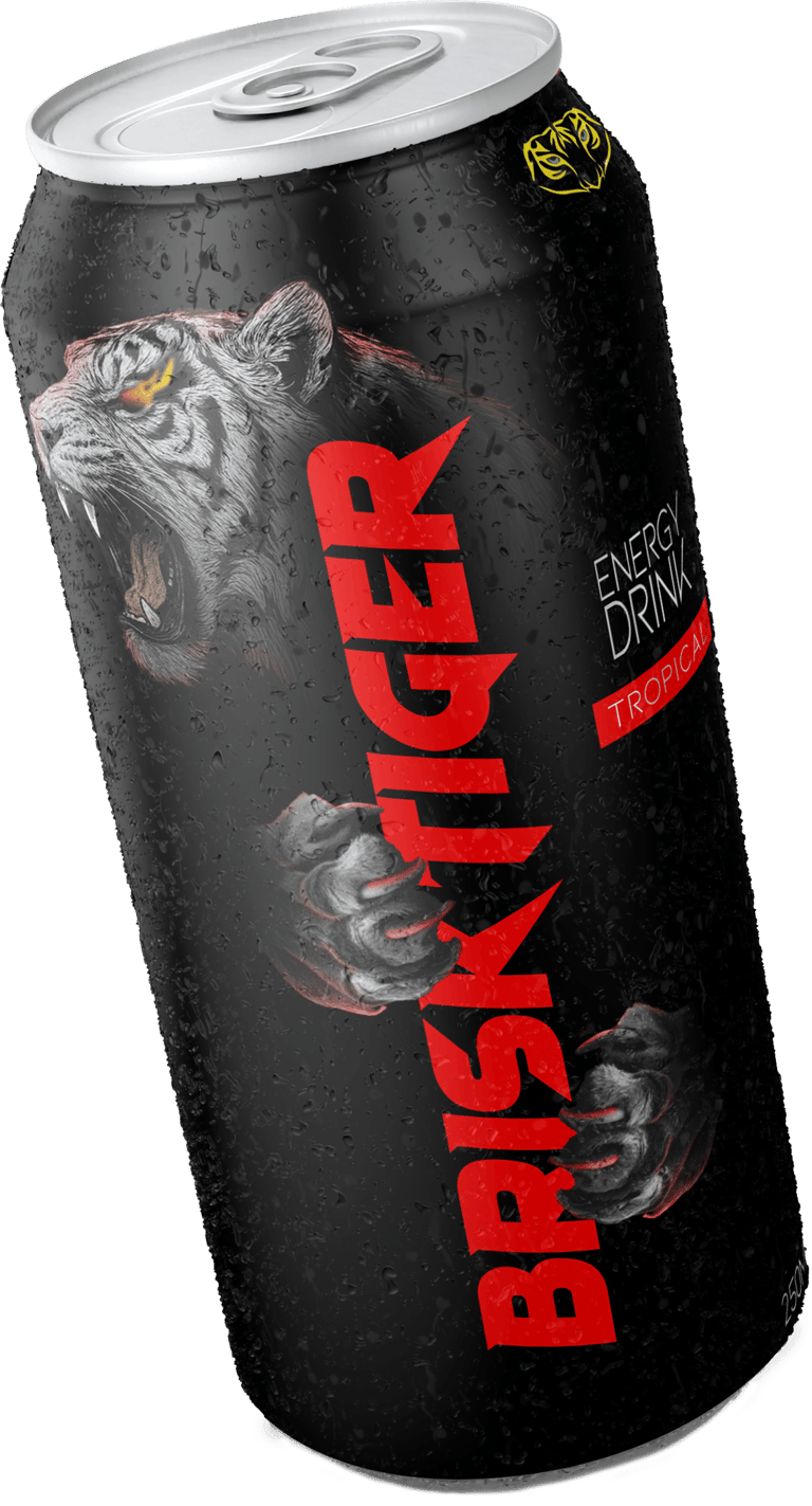
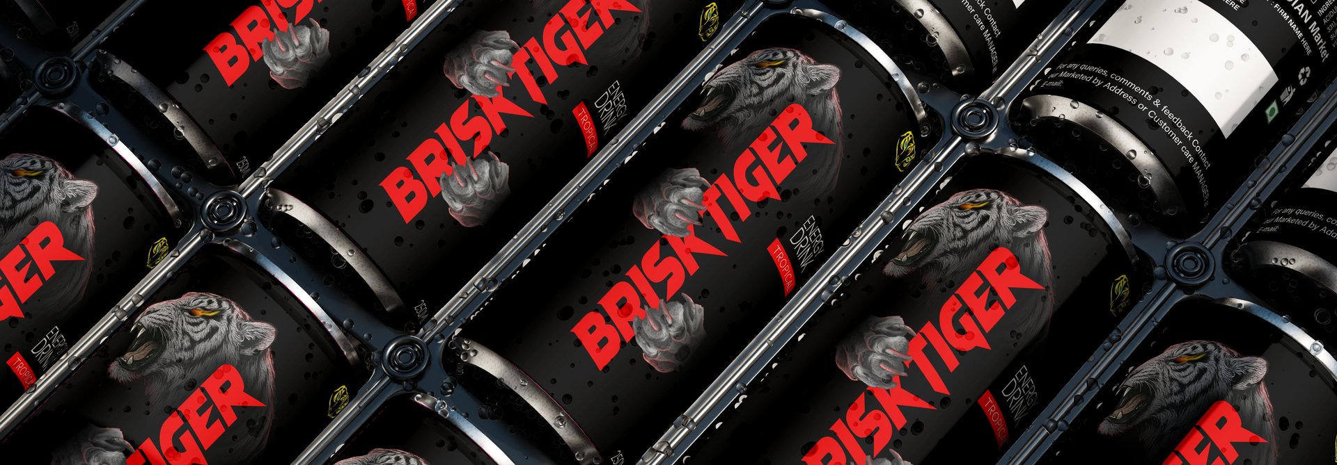
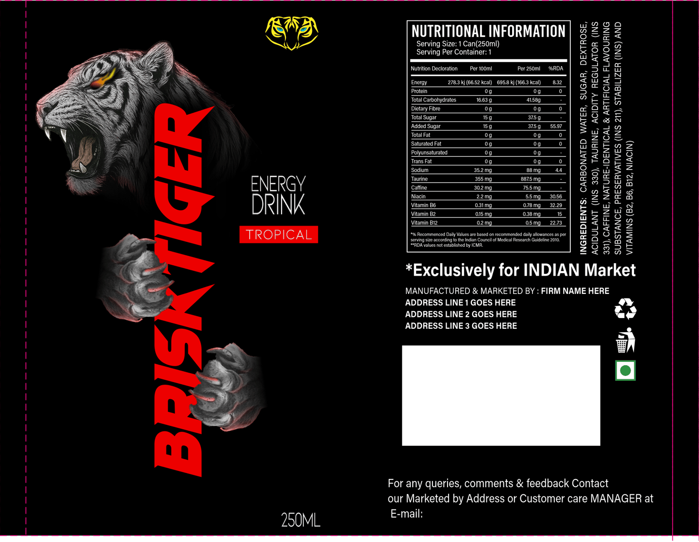
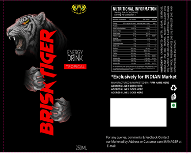
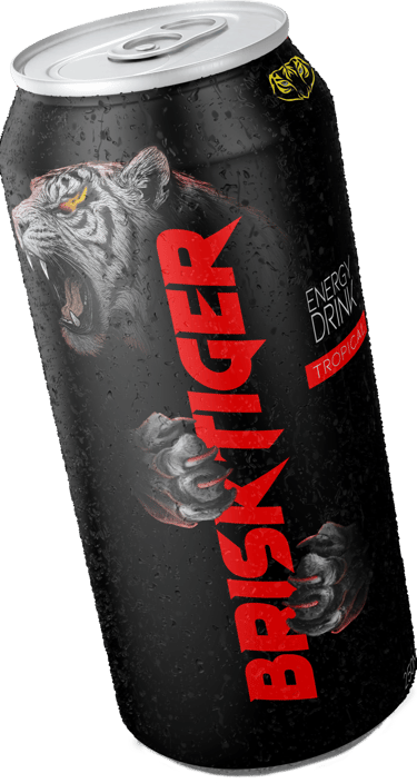
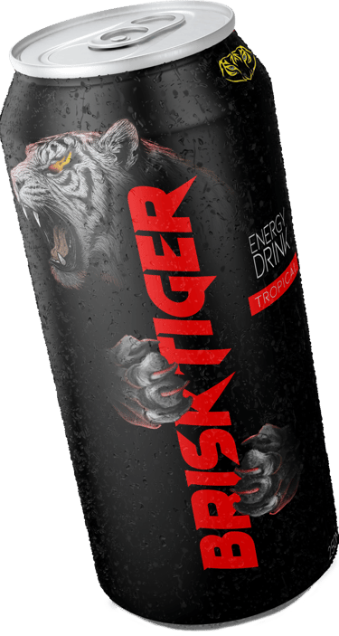
Brisk Tiger is a conceptual energy drink brand designed to communicate power, intensity and raw energy. The packaging aims to capture the aggressive spirit of an energy drink while creating a bold shelf presence that immediately grabs attention.
The design focuses on a dark, high-contrast visual identity combined with strong typography and a powerful animal motif to symbolize strength and adrenaline.
Design Concept
The core idea behind the packaging is unleashing inner power.
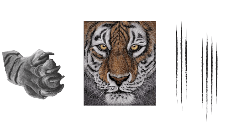
The roaring tiger illustration represents energy, dominance and fearless attitude — qualities often associated with high-performance energy drinks.
The clawed hands emerging around the typography reinforce the idea of strength and explosive energy.

Visual Strategy
Color Palette
Deep black base to create a premium and aggressive feel
Bold red typography to represent power, intensity and adrenaline
Subtle metallic elements for a modern energy drink aesthetic
Typography
The bold angular lettering of “BRISK TIGER” enhances the aggressive tone of the brand and ensures strong visibility even from a distance on retail shelves.
Illustration
A roaring tiger with sharp detailing and glowing eyes acts as the focal element, symbolizing raw strength and fearless energy.
Outcome
The final design creates a bold and memorable energy drink identity with strong shelf presence and a clear visual narrative of power and intensity.
Get in touch
Address
The Urbania, Palm Rd, Urjanagar 1, Kudasan, Gandhinagar, Gujarat 382421
Find Us